Look development
Early 2018 we were presented with the challenge of creating a mask that acts like a mirror. Not only would it need to reflect the world around it but also the performances of nearby characters. Our team at MARZ had created the iconic mask seen in Zack Snyder's 2008 Watchmen film so this material was well understood and we were able to hit the ground running.
The next day was spent shooting test footage around our studio located in Toronto, Canada. We came across a railroad underpass completely painted over in hazard patterns. The team thought this was an excellent location and were eager to see what a mask looked like reflecting those patterns. Our CG supervisor Anthony Dechelis started in all out tests. He wore a chrome painted mask littered with orange tracking markers. This along with a few HDRI’s gave us enough data to start experimenting. Bellow are the initial tests we completed.
Test 1
The first was something a little dark that incorporated a reflective surface. It ended up not fitting into the world Damon Lindelof was painting so we ditching it quickly. If anything it helped get our creative juices flowing and started to turn heads around our studio.
Test 2
The second test started to give the impression of a mirror surface. We simulated a cracked mask over the performers face. This was a great look but it didn’t allow us to clearly see what was being reflected across his mask. There were multiple moment throughout the show where reflection’s played an important role and we needed to design a surface that allowed the viewer to clearly make them out.
Test 3
The third was the first test that demonstrated a nice clear reflection of the environment. It Looks too much like a hard shell but it executed the idea and became the base we refined.
These three sketches were presented to Erik Henry the senior VFX Supervisor on Watchmen who worked closely with us to define the look throughout the project. With the first successful test complete our next step was to give the impression of a flexible mirror material that our previous test failed to deliver. Bellow is the example of our first cloth simulation rendered to look like a reflective cloth.
Test 4
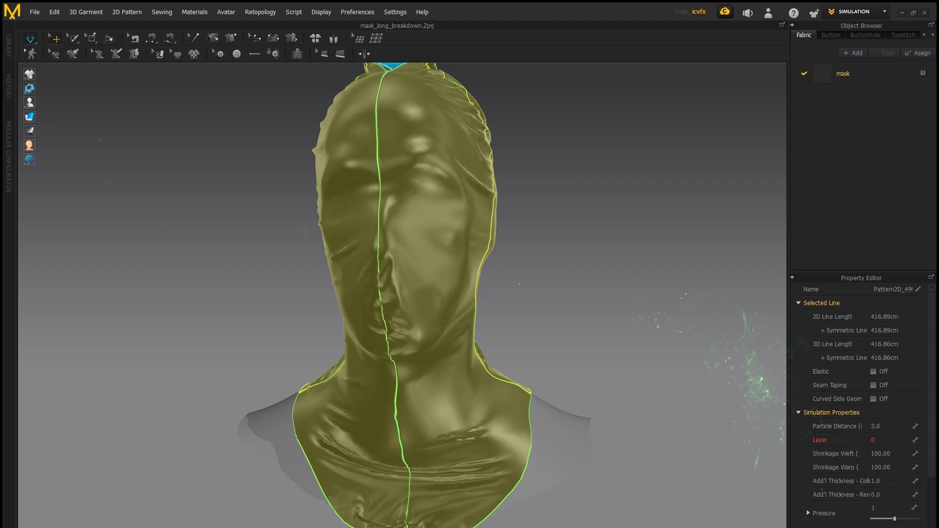
With this test complete we began to start bringing in the final characteristics of the masks overall shape and damage. Scanables provided us a scan of the actors. We brought this scan data into Marvelous designer to accurately simulate different seams and tightness of fabric.
We ended up going more tight with the mask than we had initially planed. This was to help show the actors facial structure’s. Unlike other mask in the season, looking glasses face was going to be completely covered. Once we had our new base shape worked out we then started to refine the look of its surface.
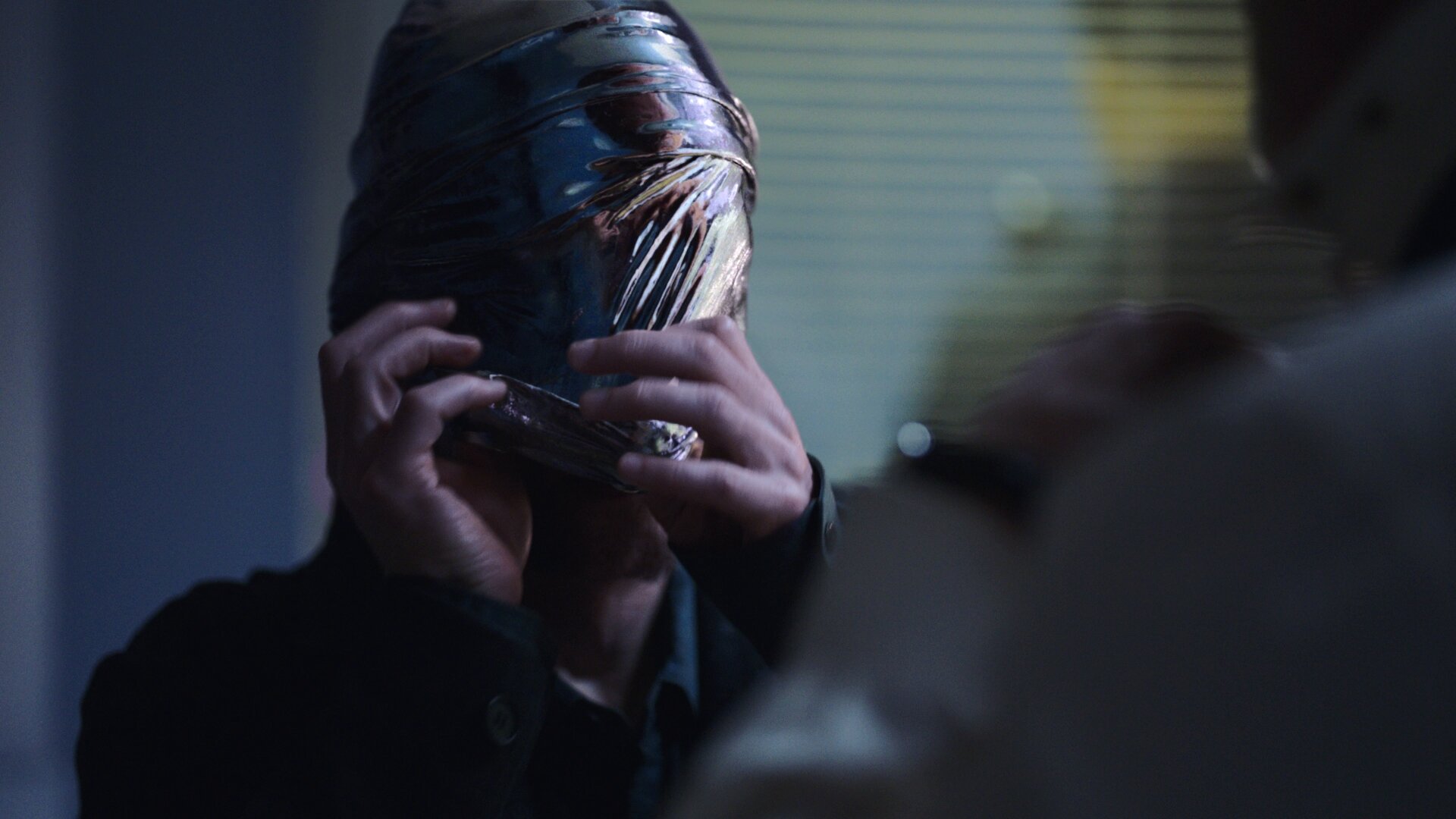
We then brought the mask Into Houdini where our asset supervisor Mike poretti generated tension maps. These map’s would allowing us to apply different treatments to the mask based on if the fabric was stretched or not. We ended up making the relaxed surfaces more mirror like and the stretched parts more like fabric. The fabric qualities were shown through a subtle weave pattern displacing the reflective surface.
Now that we have the qualities of fabric it was time to mix in different levels of wear and tear. At first there was some push back on the damage but as time went on it became clear that this is what made the mask believable. The jacket Tim wore had all types of frayed edges and variation of roughness that our asset would be right next to. All this look development was done in substance designer and rendered in Maya Redshift.
We ended up creating 6 different looks for the mask and mixed them together differently depending on the environment and distance from camera. One wide shots we had looks with larger weave patterns and larger damage. On hero shots the surface had finer scratches and smoother surfaces to showcase hero reflection’s. In the end there was never a shot that used only one look of a mask. All shots were a mix of a rough and smooth look mixed together differently to achieve the final shot.
The next challenge was creating a reliable way of capturing real time reflection data from the shoot to use in post. We didn't want to have to ask production the shoot reflection takes for each shot. This would have slowed down the shoot and never be a technically perfect reflection. We began experimenting with the idea of capturing reflection data with a camera system mounted to Tim’s head during the shoot. To do this we needed to find the best 360 cameras for the job. After many tests ended up choosing the RYLO 360 camera. This was at the beginning of 2018, 360 cameras have come a long way since then. The RYLO camera shot the smoothest video when compared to every other competitor. The footage needed to be perfectly stabilized so we could reflect and stable environment onto the CG mask. The geat thing about the RYLO cameras at the time was that they used an internal gyroscope/ accelerometer to stabilize the footage in reel time. All other solutions use a post effect that would analize the footage and then stabilize it. The RYLO allowed us to skip this step all together.
We then began working out how to go about streamlining the way we brought that footage into our pipeline. At that point in time the only way to stitch the footage the RYLO shot was on a phone or tablet. We ended up contacting RYLO to get early beta access to their desktop version of the stitching software.
We combine this footage with HDR and LIDAR data from set. Our lighting team started by stitching and prepping the set HDRI. This usually involves white balancing, Hue and luminance correcting the image to match the shot footage. Then we paint out element like c stands, lights and crew to get a clean environment to reflect.
In 3D we begin constructing the set. Every wall, window, light and piece of furniture needs to be in the correct position to produce the proper reflection parallax in Looking Glass’ mask. The HDRI is then projected onto the set geometry. This step typically requires a round trip back through the paint process to adjust or edit elements that aren’t lining up correctly to our set measurements.
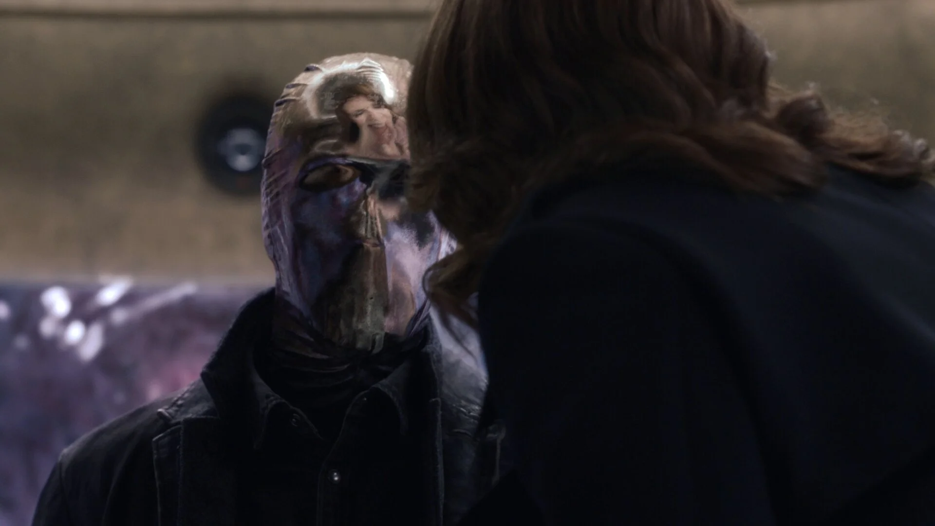
Now that we have a solid base to build the effect we take the animated mask into our lighting environment and begin crafting the lighting and reflections. We based the overall shape and folds in our digital mask to the look of the real mask seen in the footage. This allows us to have a unique looking mask across the series. In addition differences the folds the camera angle has a potential to produce a widely different reflective result. This can lead to the feeling of inconsistency between shots. To help counteract this we render out several different variations and utility passes of the mask to allow compositing to blend in the elements needed to produce the desired result. Some shots are comprised of 4+ different masks to achieve the desired reflection.
To manage all these changing variables, we created a script driven lighting pipeline that takes care of the majority of render layer and render output settings and presets, allowing the lighters to concentrate on achieving the desired look. This required the creation of a light rig that allows us to art direct reflections to a high precision. We arrived at a mix of normal based shading techniques driven by asset level surfacing adjustments as well as an array of geometry based cards positioned in the light rig. On these cards we project rotoscoped characters captured from set with the 360 head camera that the actor wore during takes. In addition we applied a series of translation, rotation and nonuniform scale’s to the light rig. This typically results in a heavily warped reality in our light rig but allows us to place reflections wherever we wanted on the mask.
Now that we have the workflow for the look of the mask streamlined it’s time to bring life and movement into it. We animated a virtual version of Tim’s his head to line up with the footage captured on the day. This animated version of the actors body is then given to our FX team to simulate the mask over his performance. We developed a few different types of cloth solutions depending on the shot. The toughest shots were the ones he would raise or lower the mask across his face. We tested a lot of different cloth solvers from ncloth in maya to sims out of marvelous designer but eventually settled on a combination of Houdini and carbon cloth solver. We would do a few different variations of the simulation and pick the one that most closely matched the look of the cloth movement in the plate. We’d then bring that simulation into our character finaling software MUSH 3D to mimic in wrinkle qualities from the footage. MUSH has some really impressive finnaling tools. The one we grew fond of for this effect was the cloth brush. Not only does this brush give you cloth like folds it also allows you to simulate new small wrinkles inside the finaling software. Most of the cloth notes we got back from client were able to be addressed in character finaling without having to go back to FX. This ended up being a huge time saver allowing our FX artists to continue working on new shots.
Compositing
The final composites were all done in the foundry's nuke. The lighting department created slap comps of their renders so the hand off was smooth from lighting to comp. The main task for comp was dialing in what parts of the mask were going to be more reflective than others. This was done with different roughness passes given to compositing and blended together across the surface of the mask. Too rough and it didn't reflect enough detail to smooth and the surface wouldn't look believable. I didn't expect the look of the mask to change so drastically from environment to environment. In brighter scenes we found we had to increase the roughness and in dark environments we had to do the opposite to keep the looks consistent. Another problem we found was highly reflective surfaces don’t show there own shape through diffuse lighting. They tend to look flat and evenly lit. To get around this we rendered out a rough grey material pass of the mask. The luminance values of this mask were then used to grade shadows to fall across the mask and give it some shape. This was one of the many subtle things that gave then mask an interesting blend between a reflective and diffuse surface. Our compositing team really hit this effect out of the park and dialed in what I would consider an invisible visual effect.


